The Approach
Why I ran this through DIBB
Data (what we can observe), Insight (what it actually means), Belief (the bet we’re willing to make on it), and Bet (the focused thing we ship). It forces every design decision to trace back to evidence rather than taste. For a domain as loaded as money, that chain mattered more than a nice donut chart, so I used it to structure the whole project, and this case study follows the same four steps.
Bet
The happy path to execution
Key screens I mocked up to demonstrate the new changes

01 · Home
Two doors, and the calmer one comes first
Instead of a dashboard, the home offers one clear choice. “Invest on autopilot” sits above “Discover markets” on purpose, nudging the anxious majority toward the calmer path.
Decision: ordering is hierarchy. Autopilot first nudges the 78% while still leaving the active path for the confident.

02 · Setup
Three sliders instead of a questionnaire
The risk profile becomes three things a beginner can actually answer: how much to start, how much each month, and how cautious to be. Sliders feel like adjusting, not committing, and “you can edit this later” quietly drops the cost of getting it wrong.
Decision: ask only what a beginner can answer, and reassure before they ask, so the fear of a wrong choice never forms.

03 · Allocation
One word, then plain English
The portfolio gets one label, Conservative, before any breakdown. The donut names what the money buys in plain words, government bonds and stocks, not a risk score or fund code. It answers “where does my money go” without a glossary.
Decision: translate portfolio theory into a sentence. Comprehension is the trust mechanism, not detail.

04 · Projection
A range, not a false promise
The payoff becomes concrete: a value plotted to a real future year, which makes “grow your money” feel true. It stays a range, not a single hero number, so it reads honestly about uncertainty and avoids the overpromise that breaks trust when markets dip.
Decision: tangibility builds belief, but a range keeps it credible. This is the screen I’d test hardest.
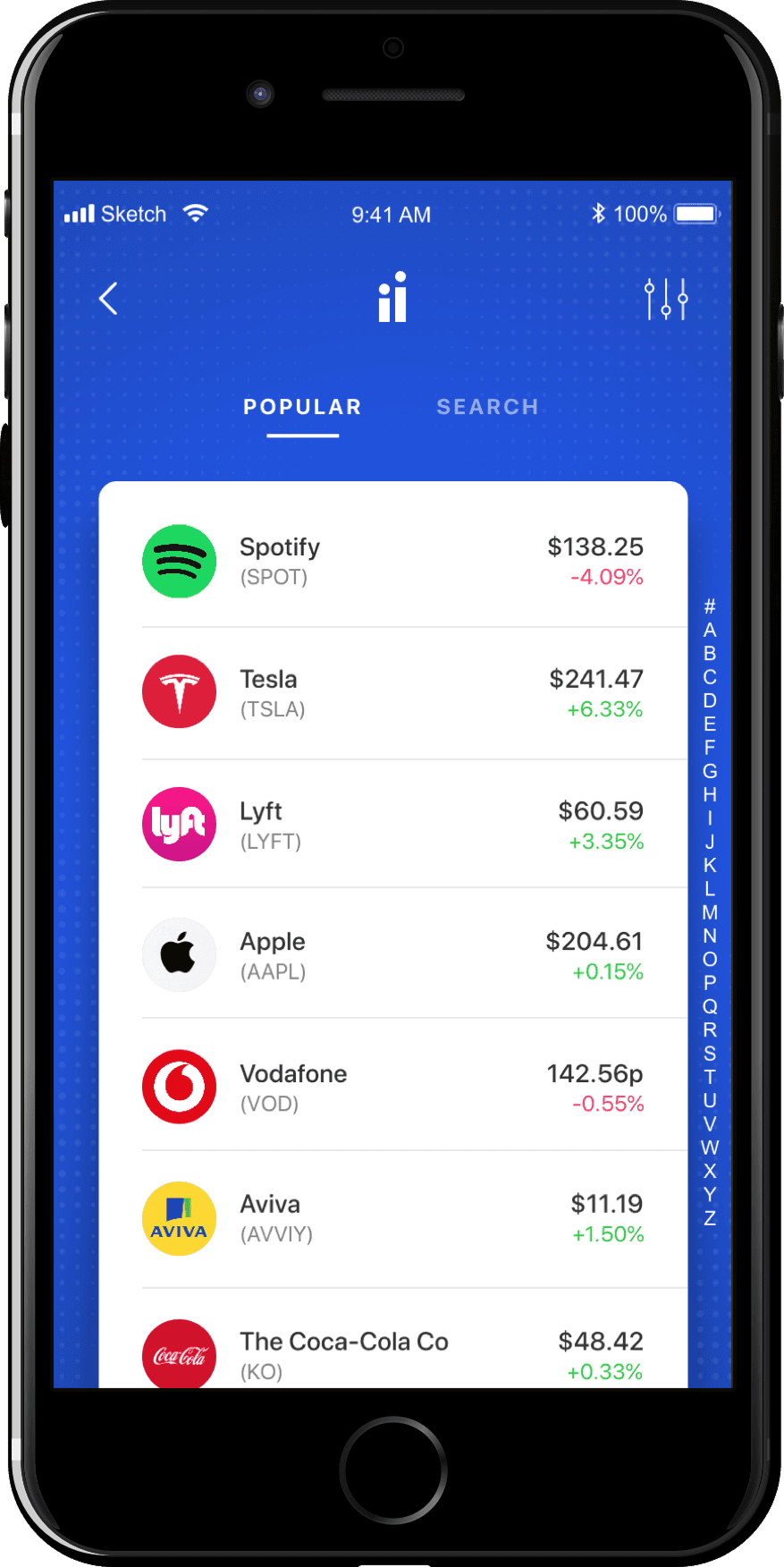
05 · Discover
The escape hatch, kept deliberately second
Confident users still get a familiar browse of popular stocks with live prices. It sits behind the second door by design, so the person it would intimidate never has to face it first. Same product, two emotional speeds.
Decision: serve the active minority without letting their interface set the tone for the nervous majority.
How to prove it
What I would validate next
This is a concept, so I’m not going to claim a conversion lift I never measured. The more useful thing is to be specific about how I’d prove or kill the bet.
Comprehension check: after the allocation screen, can a user explain in their own words where their money is going? If not, the plain language isn’t plain enough.
Drop off at projection: I want to know if people actually think that they're not getting enough value for their money, then there's something wrong with the way this product is positioned rather than the way the UX flow actually works
Riskiest assumption: that a projected range builds trust rather than triggering skepticism. I’d A/B the range against a single figure and a no number variant, and watch drop off at that exact step.